Insight into our branding process

Insight into our branding process

Maybe you’re considering a re-brand, or maybe you want to develop a brand strategy for your company for the very first time. Either way, you might imagine the process to be daunting and scary. But let me assure you that at Noto Designs we strive to keep the process as smooth and pain-free as possible for our clients! Here’s a brief glimpse into what our process looks like if you decide to work with us on your company’s branding.

STEP 1: DISCOVERY

We know from experience that any successful project first requires an in-depth understanding of our client’s company, industry, target market, and company vision. We also strive to begin each project with having the same expectations as our client regarding the design direction and desired outcome. Because these things are so important, we carve out a chunk of time at the beginning of each project to dedicate to question-asking and research. We will begin by sending our client our detailed Brand Discovery Questionnaire, and then use the answers to direct our research.

If the project we’re working on is a re-brand, we will also use this time to analyze our client’s current brand and ask questions to figure out what about the current brand is working and what needs to change.

STEP 2: DEVELOP THE BRAND STRATEGY

We will take what we’ve learned from our discovery sessions and use that information to influence our brand design decisions. Taking the answers from our discovery questions as well as what we’ve found during our industry research, we will create 3 unique visual brand strategy concepts to present to our client. These concepts will outline the visual specifics of the new brand, such as color palette, typography, illustration/graphic styles, photography styles, visual textures, and general layout design.

From these 3 concepts, our client will choose one that they think works best. We will then work through up to 3 rounds of revisions to finalize the design decisions and narrow in on each specific element.

The design decisions made during this step of the process will lay the foundation to every other design created for this client going forward.

It might seem counter-intuitive that, when designing a brand, we don’t begin with designing the logo. This decision is intentional: we want to ensure that the entire brand is consistent with our client’s goals and desired brand personality, and that it is relevant our client’s demographic. We have found that the best way to do this is to begin by designing the overall brand strategy before diving into each specific design element. This process ensures that all aspects of the new brand are as consistent as possible.

STEP 3: DESIGN THE SPECIFICS

At this point in the process is where we narrow in on the specific design elements required for the new brand to launch. Typically the logo design comes next. Using the new brand design as a guide, we create 3 initial logo concepts and work through up to 3 revisions on the chosen design.

Because we’ve already dedicated time to determining the brand’s color palette and graphic styles, we have the groundwork laid for the logo design to build upon. This process gives us lots of good direction and streamlines the process a bit, ensuring that we don’t waste time on concepts that don’t even make sense for the brand.

After the final logo is created, we use the brand guidelines to create whatever other collateral our client needs, such as business cards, website design, promotional flyers, email templates, and more.

This gives you a brief idea of what it looks like to create a new brand with us. If you have any other questions or are interested in either a new brand or a re-brand for your company, please reach out to us!
How to know when it’s time for a re-brand

How to know when it's time to re-brand

Maybe you’ve played with the idea for a while, or maybe you never want to go near the branding process ever again, but it’s important to recognize the key signs that show your company needs a re-brand.

You should approach your brand as though it’s fluid and it’s a good idea to make a practice of reassessing your brand strategy annually. If you have these two mindsets in place it puts you in a better position to be able to give your brand what it needs to flourish and to appropriately assess when you might need to re-brand.

IT DOESN’T HAVE TO BE A TOTAL RE-HAUL

First off, I want to explain that there is a broad spectrum of what can be defined as a “re-brand”. Although sometimes necessary, performing a re-brand doesn’t necessarily mean that you need to do a complete re-haul. Sometimes it just means making slight changes to what’s currently working for you to better improve your impact. We see major companies do this all the time.

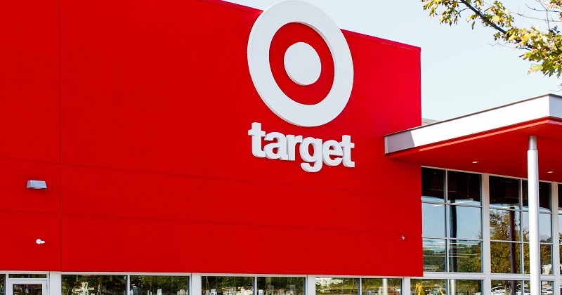
In 2018 Target launched a re-brand initiative. This re-brand involved remodeling some of their stores to better serve the needs of the local communities in which they were located. The focus was on making their stores more user-friendly and appear more upscale. At the same time, they launched a variation on their logo design. Instead of their name being in all caps, it now appears as all lowercase:

Target is still carrying out this rebrand initiative, and the Target near where I live just underwent this type of remodel.

You can see in this example that the Target brand still maintains all of its integrity and recognizability, but is slightly more improved to better connect with its target market.

SO, HOW DO YOU KNOW WHEN IT’S TIME TO RE-BRAND?

It’s true that in the name of consistency, you shouldn’t be performing re-brands left and right. So how do you know you need one? The answer is different for every company. Here are some quick questions to ask yourself about your company that might determine if you need a re-brand.

1. Has your target market changed? Or do you understand your target market better than you did when you first branded your company?

Any time you notice your company servicing or advertising to a client base that’s different from the one you set out to serve, you need to reassess your brand strategy. If your initial brand was designed to reach one demographic and then you switch audiences, you must determine if the same strategy you were using will work for your new audience. You might find that parts of your old strategy still work, but that you need to reimagine other areas to become more effective. Or, you might need to go back to the drawing board and design a new strategy.

2. Do your visuals and methods appear outdated? Do your customers comment that your branding looks “old”?

What worked ten years ago is probably different than what will work today. True, some methods are timeless, but you also want your company to stay relevant to the people you’re trying to serve. The fact is that as technology progresses people are constantly given new expectations that they then project onto the brands they consume. Companies need to be thinking of ways they can constantly become more user-friendly, more easily accessible…more of what their audience wants and expects. This plays out in all areas of your company – from your logo design and typography to your in-person or online user experience.

3. Do you blend in with your competition?

If your branding is too generic, then you won’t stand out adequately among your competition. Your brand needs to be memorable, so that customers or potential leads won’t get you confused with your direct competition. You want people to remember you, so you need to make a unique impact to be able to stand out. If you notice that your branding looks and feels too similar to that of your competition, then it might be time for a re-brand.

4. Do you need to outgrow a poor reputation?

Does your company have a bad reputation? Do you want to change the way people perceive you? Lots of companies have successfully accomplished this through a strategic re-brand. A prime example is McDonald’s. In the past, they were always considered the cheap and unhealthy option. They decided to re-brand their stores to overcome this public opinion. They turned their focus on designing their restaurants to be more attractive, bringing in more natural, earthy colors and textures, and better-designed furniture. Together with this, they focused on offering lots of healthier options, including salads, grilled chicken sandwiches, and yogurt parfaits.

McDonald's

While we still might think of McDonald’s as the cheaper fast food, we also know that it’s an easy on-the-go place to find some healthy options.

Choosing to perform a re-brand for your company is a big decision, but it’s an important one, and one that you should never be too afraid to consider. Its impact could greatly increase the forward momentum and effectiveness of your company in ways you can’t now imagine!

Hopefully this gives you an idea of what to look for when considering a re-brand, and perhaps you’ve decided your company could use one! If that’s the case, please reach out to us for a free consultation, and we’ll help you figure that out.

Typography matters!

Typography matters

Let me introduce you to a critical aspect of your brand: typography! “What is typography?” you ask?

Typography is the style and appearance of written material. And yes, it matters.

For a lot of companies, the amount of thought that goes into their typographic choices extends to the default fonts on their chosen website templates. And if those companies are going to be really strategic, they’ll find out what those fonts are and use them in the rest of their marketing material (although most people don’t get this far).

A majority of companies, however, will settle for about 15 different font choices being used throughout all of their marketing platforms. Why is this a problem? Let me remind you of the importance of brand consistency. If your company is going to maintain its visual integrity across every platform, then you absolutely must pay attention to your typography – and orchestrate it so that it further articulates your company’s personality.

TYPOGRAPHY REPRESENTS YOUR COMPANY’S PERSONALITY

It would be easy to think that typography doesn’t really matter and that “it’s just for those graphic design nerds”. But it really should matter to you if you’re trying to build a cohesive, on-mission brand.

Typographic choices are just one area through which your company’s personality gets fleshed out.

Do you want your brand to be relatable and approachable? Try using (sparingly) a handwritten typeface (the fancy designer word for a specific font choice within a font family):

Typography Example 3

Do you want your company to appear high-end and luxury? Try a tall, thin, sans-serif typeface in all caps:

Typography Example 1

Does your company wink at antiquity and a long history? Try using an established “book-ish” serif typeface:

Typography Example 2

Do you see how each of these examples drastically change the message of what’s written, just by adding a visual layer of interpretation? (In real branding, we would also accompany these font choices with color and some design styles to add an even deeper level of meaning.)

IT NEEDS TO BE CONSISTENT

As with everything else that we ever talk about, constancy is key! Once you (or your brand designer) establishes your company’s chosen typography, as much as it’s within your power, don’t stray from it. It might not be possible to use your font choices 100% of the time (there are certain channels that are limiting with regards to this, such as websites and emails), but when you can, always use your brand’s fonts. Being consistent with your font use familiarizes your clients with who you are, building trust and loyalty.

LIMIT YOUR FONT CHOICES

Yes, there are lots of cool fonts out there, we understand. But please, to keep your designer (and clients) sane, don’t use them all! Following the general rule of brand consistency will tell you that less is more – it’s difficult to be consistent if you’re using a million different fonts as opposed to two or three good ones. And, let’s face it, scrolling through a web page, for instance, that uses 7 different fonts, is confusing and looks rushed and messy. We recommend choosing two main fonts, with a max of three if your third is a decorative font that is used very sparingly.

Your font choices should be strategic. The process of choosing yours should involve time and effort, and the fonts you end up with should be representative of your brand’s personality.

If you’d like help assessing your current font choices, or taking the time to choose new fonts going forward, please reach out to us!
What is brand personality?

What is brand personality?

You’ve heard us mention brand personality as an important piece of your overall brand strategy, but what exactly is it? And how do you go about defining your company’s personality?

WHERE ARE YOU ON THE SCALE?

Brand personality is something that is chosen at the beginning of a branding project. These early decisions are used to influence the larger creative strategy.

Think of personality as your company’s position on a scale between different character traits. A set of character trait “pairings” make up a visual personality spectrum. Here is a visual example of a luxury makeup company’s potential personality spectrum:

Brand personality spectrum

It’s important to define where your company lies on this spectrum in order to, as always, make sure your messaging is clear and consistent. Determining where you are on this set of scales will not only influence how you relate to your audience, but also who your audience even is.

WE’LL SAY IT AGAIN: CONSISTENCY IS KEY

You might be tired of hearing it by now, but it’s worth repeating: consistency must be your top priority when it comes to communicating with your customers. It’s quite impossible for a company to be both personalities on either end of the scales in our example without coming across like it has a personality disorder. It’s important for your customers to perceive you in a consistent way no matter how they’re interacting with you.

TAKING IT VISUAL

Determining your company’s personality is so important when it comes to translating your strategy into a visual brand. These initial decisions are key in determining which approach your designer takes with your company’s visual branding. It will influence what your designer takes into consideration when it comes to color palette, typography, and graphic styles.

For example, if a company wishes to come across as down-to-earth, fun and personable, I might choose a bright, playful color palette and hand-drawn graphic elements to accentuate a certain amount of organic human-ness. If, like our personality spectrum example above, I’m working with a company who wishes to exude a high-end, luxury feel, I might choose a very muted color palette, with strong blacks and whites, perhaps with a hint of gold lines here or there. I would focus on geometric graphic elements, using hard lines and shapes with a good amount of white space.

These two examples are just some of many, but you can see how important a well-defined brand personality is in determining the rest of your overall brand strategy.

If you’d like us to tell you how well your brand is communicating your desired personality, please reach out to us and we’d love to offer you a free brand analysis!

Your brand’s color palette

Your brand's color palette

We’ve already established that, regardless of whether you use it strategically or not, your brand is always communicating something about your company. This concept reaches across all aspects of your brand – from your logo, to your typography, to, yes, your chosen color palette.

WE BEGIN WITH…YOU GUESSED IT…STRATEGY

Each of your brand’s elements should be strategically composed to communicate accurately and clearly to your target market. This is why, when considering any aspect of your brand, you must begin by referencing your brand strategy (this assumes that you have already taken the time to consult your brand designers, fill out a brand questionnaire and personality profile, and articulate what is your brand strategy moving forward).

Colors communicate something just by themselves, and when combined with other colors in a meaningful way, they can orchestrate a beautifully intentional message. This is why we spend so much time asking you about what kinds of ideas or personalities you want your brand to portray.

COLOR SPEAKS

Don’t worry, we won’t dive into a collegiate-level color theory class, but suffice it to say that color is a powerful tool in getting across a particular message. Below are some examples.

If a client asks me to create a brand that embodies peace and calmness, I might choose the following color palette. The color palette uses entirely cool colors (we use the term “cool” to refer to colors closest to blue on the color wheel). Not only are these colors cool, they are also very low in vibrance and saturation (they aren’t very bright versions of these blues/greens). This palette is reminiscent of a calm ocean or lake.

If a client is seeking to create an exciting, technologically modern brand, I might suggest the following color palette. In contrast to the palette above, these colors are very vibrant and bright. There is a combination of cool and warm colors, but the vibrance and saturation of the colors makes this palette very high-key and noticeable. This palette wants to make a bold statement.

If a client wishes for his or her brand to be rather exclusive and high-class, I might choose something like the following. Some of these colors are very mute and soft, with some highly-contrasted dark colors to set them off. This palette carries a sense of elegance and seriousness.

COLOR DOESN’T STAND ON ITS OWN

Even though color can be used as a powerful part of your brand, it still relies on the other aspects of your brand to specify your mission. Each color requires a context in order to be interpreted correctly.

For example, in some cases the color red can mean alarm or danger, while in other cases it can signify excitement and joy; it all depends on the specific use case. This is why we must orchestrate all other brand elements to further stress your brand’s strategic message.

Unsure if your color choices accurately reflect where your company is going? Reach out to us, we’d love to help!

Why is branding important?

Why is branding important?

We’ve been diving into topics like “what is a brand?” and learning how to use a brand to communicate strategically, but none of that matters unless we understand the importance of a good brand strategy. Because crafting a beautifully on-mission brand takes time, money, effort, and sometimes a total re-haul of what you currently use, it would be easy to throw your hands up and wonder “what’s the point? Why is this important?” But I want to answer that by saying your company’s branding is actually one of its most valuable assets and should be treated as such!

If, as we’ve discussed, your brand is the strategic representation of who you are, aimed at potential and current customers to gain loyalty and build connections, then it should not be taken lightly.

ASKING THE RIGHT QUESTION

The question you might be asking is “should I have a brand or not?”, but this is in fact the wrong question. The reality is that every company has a brand. The right question to ask is “am I crafting my brand to be strategic?”

Don’t believe me that every company has a brand? Read on.

If branding is your company’s strategy for communicating with your customers, then it is measured by customer perception. This means that every time you have communicated something to your customers – every email, phone call, advertisement, meeting, or flyer that they’ve ever seen from you – you are further shaping your brand by shaping their perception.

CREATING EXPECTATIONS

When your company communicates with your customers (current or potential), every interaction you make either creates or further shapes an existing expectation they have about you. The more they hear the same consistent message from you, the more they learn to trust you. This is why consistent, strategic branding is so important!

Here’s an example. Suppose you have just opened a new café in town and initially you tell people that you created it to be a nutritious go-to stop for health-conscious people with busy schedules. Some of your initial advertisements are focused on helping your customers feel better and your logo boasts some healthy-looking greens with an energetic font. So, your potential customers’ initial reaction will be that they will come to your café if they want to add a new place to their healthy regimen. This initial marketing effort will inherently attract a certain demographic of active, food-conscious people.

Now suppose that, a couple weeks later, your advertisements begin to focus solely on some of the more comfort-food items that you offer. Suppose these new advertisements don’t mention anything about it being yummy and healthy, only that it’s yummy and comforting. Not only that, but you have decided to use different fonts, a different color scheme, and different photo styles. Wouldn’t this be incredibly confusing to your audience? They’d wonder if they were even reading about the same company as before.

As we’ve discussed, each element must be used strategically and cohesively to constantly be telling the same story. You must set out to decide the expectation you wish you instill in your audience, and everything you do after that must further influence your chosen message.

TELLING YOUR STORY

Having a strategic brand really is one of your company’s most valuable assets, but unfortunately it is also often one of its most ignored. But there is always time to change that! You can choose to begin to tell the right story to your customers – the one that is a true representation of your company and that will create the right expectations for your audience.

Feel inspired to take a fresh look at your brand? Reach out to us, we’d love to help!

What does your brand say about you?

We’ve already answered the question “what is a brand?”, so now it’s time to look a little deeper into the details – like what does your brand say about your company?

If your brand is saying something about your company – and believe me, it is, whether you think so or not – then shouldn’t it be on-mission, clear, and cohesive? We think so. Otherwise, what’s the point?

We already mentioned that an inconsistent and unclear brand leads to customer confusion, disloyalty, and wariness. Are these things you’d want your customers to perceive about you? Probably not.

USING YOUR BRAND STRATEGICALLY

When used strategically, your company’s brand can communicate a wide range of things about your company’s personality and mission. But this first requires you to understand and define those things.

When we begin a branding project, whether it’s a new brand or a re-brand, we start with understanding the basics: who is your target market? What pain points do you solve for your customers? How are you different from your competition? What is your company’s personality profile?

Answering these questions is key to developing an effective brand strategy. You must first understand where you are to define where you’re going.

From here, we use visual and written language to communicate these aspects of your company through on-mission branding.

DISCOVERING YOUR BRAND’S PERSONALITY

People do business with people. We hear that everywhere, and it’s true. Your target market is much more willing to pursue you if you “feel” familiar to them. Seek to create a personal connection. Talk to them in their language, using images and ideas that they understand and trust. You must become the thing your target market is seeking for them to allow you to solve their problems.

Creating a community like this using a strong brand personality might feel like too big of a jump. After all, if you chase a niche target market, you will no longer be relevant to “everybody”. But let us encourage you that that’s okay. That’s actually good. Planning your brand strategy in this way will actually create more loyalty among the people who do choose to follow you. They will tell others who are “like them” about you. You will be more honest about who you are, and ultimately more successful because you aren’t distracted with trying to please everybody.

So, boldly pursue “your people”. Connect with them. Let your brand do the talking.

Curious to find out what your brand communicates about your company? We offer free brand analysis – click here!